Lay’s, a brand that dominates globally with unmatched recall, realized that the physical experience of snack shopping still drives 82% of chip sales even as online buzz explodes. Shoppers crave more than just taste: they want an emotional connection, ingredient transparency, and Instagrammable packaging that stands out on social and in-store shelves. Thus, the Lay’s team embarked on a top-down reinvention, syncing visual identity with today’s consumer values sustainability, authenticity, and healthier options.
Behind the Lay’s Logo Glow-Up: Sun, Ribbon, and Realness
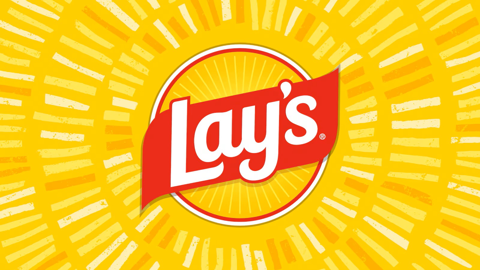
The new Lay’s logo leverages decades of brand equity while signaling a fresh start. The classic yellow orb now beams like the sun, wrapped with a vibrant red “gift ribbon” symbolizing farm-fresh joy and the journey from field to bag. This identity is crafted for digital virality: symmetrical sunbeams evoke happiness and flavor, while photographic details like potato slice “stamps” reinforce authenticity, ensuring universal recognition in both Indian and global markets.
Typography isn’t left behind: playful scripts give way to bolder, more legible fonts, echoing the ribbon’s curve and providing crisp legibility for every screen and snack shelf.
Packaging That Pops (And Trends)
Lay’s new packaging is a triumph of sensory and social appeal. Out go the shiny, candy-style graphics; in come textured woodgrain backdrops and vibrant local colors think earthy green for pickle, rustic red for barbecue anchoring every flavor in real food experiences. The packaging uses tactile matte finishes in certain markets, echoing the feeling of farm crates and picnic tables. Hi-res, top-down food photography (inspired by Instagram’s popular plate shots) lets each chip shine, giving “Insta-worthy” a whole new meaning for snackers and content creators.
These packs are optimized for rapid digital and in-store “findability.” Whether scrolling or shopping, the new look tells an immediate story: real ingredients, fresh flavors, and an experience worth sharing.
Ingredients: Clean, Conscious, and Credible
Lay’s new positioning isn’t skin deep. By the end of 2025, Lay’s core chip flavors in North America will be free from artificial colors and flavors, following global shifts to higher-quality oils like olive and avocado for select lines (cutting fat without compromising taste). These moves aren’t just on trend they address growing demands for “clean label” foods, elevating Lay’s from everyday snack to health-conscious brand hero.
For digital-first shoppers, this translates to key SEO traffic drivers: “No artificial flavors,” “olive oil chips,” and “healthier potato snacks” are all explosive search queries this year. Lay’s is transforming chips from guilty pleasure to shareable wellness treat a narrative that’s dominating foodie headlines and consumer feeds alike.
Data-Driven Design: Winning at Retail and Social
This rebrand wasn’t a shot in the dark. Lay’s ran global eye-tracking and in-store tests, boosting “findability” by ensuring shoppers effortlessly spot their favorite flavor and the trusted Lay’s badge in crowded aisles. Simulated and real-world tests confirmed that descriptive photography and clear color cues improved both speed of recognition and impulse purchasing. The brand also tapped influencer campaigns, especially on Instagram and TikTok, tapping into user-generated content: #LaysRebrand is trending with snackers showing off their favorite flavors in high-definition beauty shots.
Strategic Brand Collaborations and Lifestyle Marketing
Gen Z and millennial shoppers want more than chips they want cultural connection. Lay’s timed its new flavors and branding to coincide with tentpole events like the Indian Premier League (IPL) and even sneaker collaborations (hello, #ColourLays), blending food, fashion, and sports into a single viral narrative. Influencer ambassadors share packs on Reels, and new “Flavours of the World” drops tap into surging interest in global and experimental snacking.
Sustainability and Regional Adaptation
Lay’s isn’t just going trendy; it’s answering calls for sustainability. Recent redesign concepts feature recyclable materials and culturally resonant, region-specific visuals (such as Indian art motifs and local flavor colors), making every pack not just eco-conscious, but emotionally memorable for local audiences.
Eco-friendly packaging and localization are prominent search themes driving Lay’s SEO; digital leaders can leverage keywords like “sustainable snack packaging” and “Indian flavor chips” in content strategies to maximize viral organic reach.
Takeaways & Inspiration for Digital Brands
For founders, designers, and digital brands, Lay’s 2025 rebrand is more than a snack update—it’s a viral playbook:
- Blend tradition with bold, digital-native design for unstoppable brand recall.
- Root all packaging in cultural trends, not just fleeting aesthetics align design with user-generated content culture and e-commerce needs.
- Prioritize clean ingredients and clear messaging to win both health-conscious millennials and skeptical traditional shoppers.
- Use data-driven social tests and influencer-led hashtag campaigns (#Lays #Lay’sRebrand #PackagingDesign) to amplify launch impact.
- Go local and green cultural relevance and sustainability elevate both SEO and consumer loyalty.
Final Word: Why it Works for Vectorlook
Lay’s rebrand bridges design, marketing, culture, and data. The campaign is influencer-ready, visually sticky, and authentically healthy primed for maximum SEO and hashtag traction.
For any digital-first business or agency, this is a playbook for breaking the internet while ringing up the registers. Who knew a chip could teach us so much about modern branding?
Frequently Asked Questions (FAQs)
1. What prompted Lay’s 2025 rebrand?
Lay’s rebranded in 2025 to align with evolving consumer preferences for clean-label snacks, visually engaging packaging, and authentic brand messaging, aiming to increase both shelf appeal and digital virality.
2. What are the major changes in Lay’s new packaging?
The new packaging features a radiant sun-inspired logo, textured woodgrain backgrounds, bold color palettes, and high-definition food photography, all designed for maximum in-store “findability” and social shareability.
3. Are Lay’s chips now healthier?
Yes, by the end of 2025, Lay’s core chip lines in North America will be free from artificial flavors and colors, with some varieties using healthier oils such as olive oil or avocado oil for reduced fat content.
4. Which hashtags should be used for Lay’s rebrand content?
Effective hashtags include #LaysRebrand, #PackagingDesign, #ViralMarketing, #CleanLabel, #BrandRefresh, and #InstaWorthy for higher Instagram, LinkedIn, and TikTok traction.
5. How does Lay’s new design support digital marketing and SEO?
Lay’s rebrand leverages trending keywords, influencer-driven campaigns, and eye-catching packaging, optimized for online searches related to snack innovation, clean eating, and design trends, making it a case study in successful digital branding.