The Nap Show, a dynamic podcast platform, approached us to create a bold and engaging brand identity. The challenge was to make the design typographic-driven, energetic, and instantly reflective of the podcast vibe while appealing strongly to a youth-oriented audience.
The brand needed a bold, type-driven design that could stand out in a crowded digital space and instantly connect with listeners.
The visuals had to feel energetic, modern, and culturally relevant to resonate with a younger audience.
The branding required a vibrant, high-energy look that mirrored the excitement and dynamic tone of a podcast show.
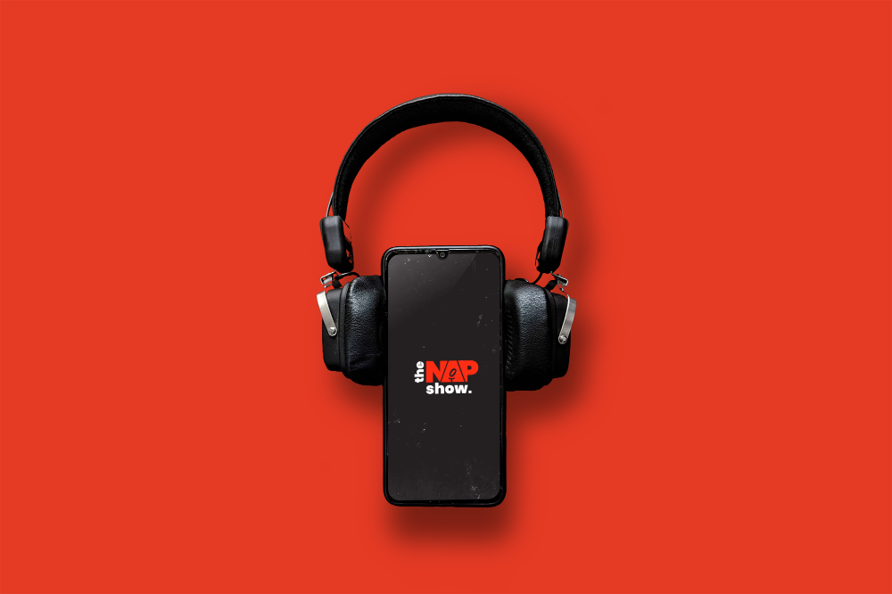
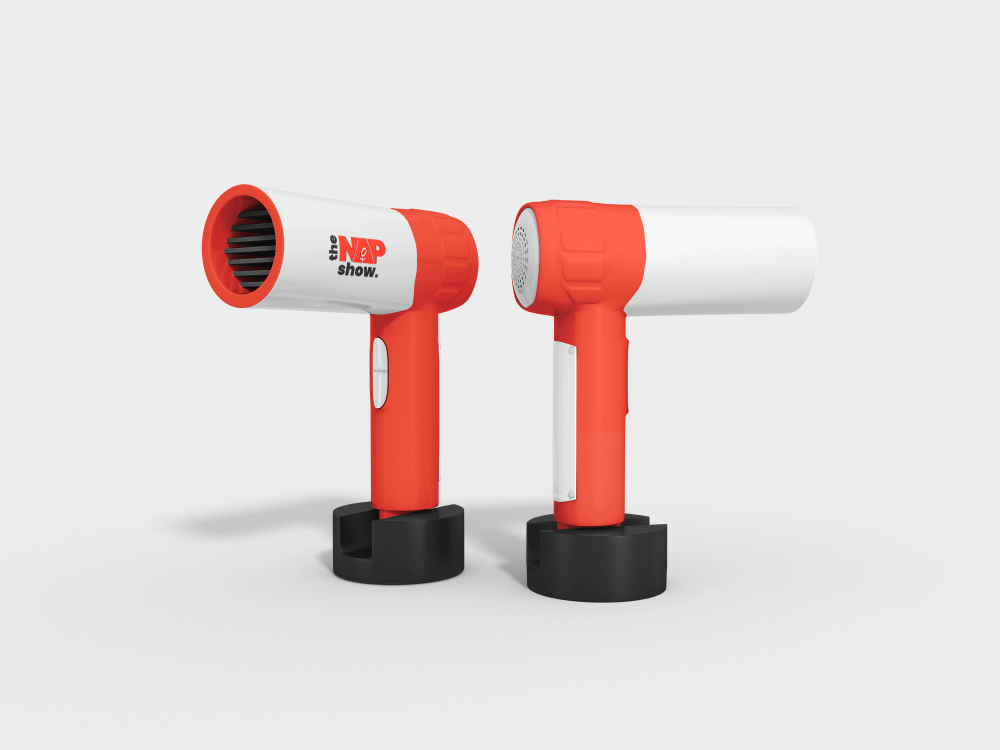
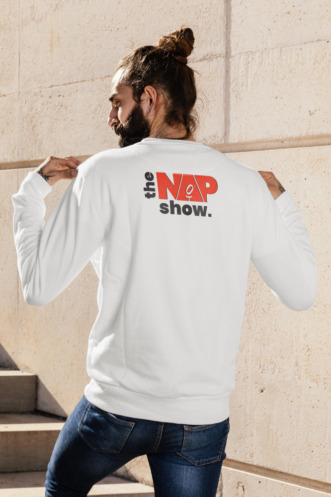
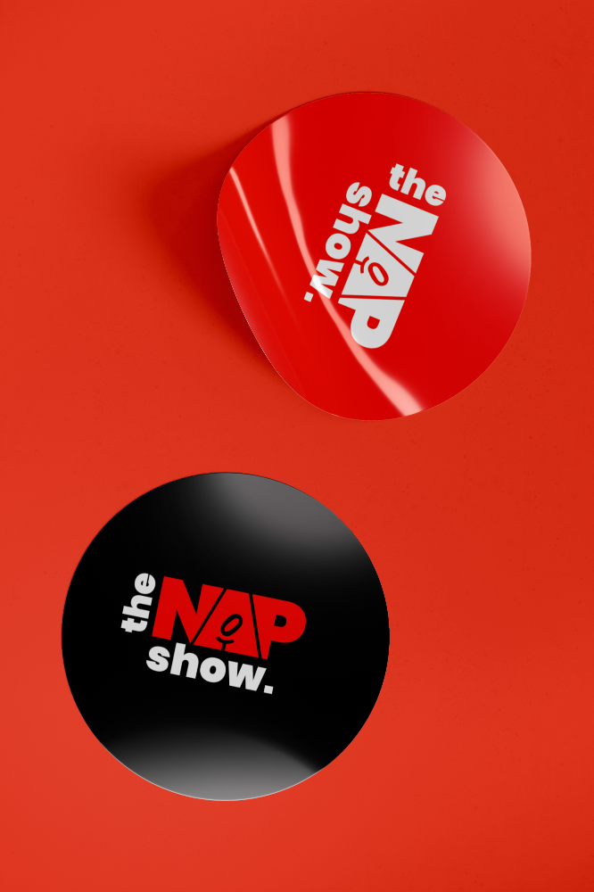
We built the brand identity around powerful, clean, and youthful typography as the core visual element, creating a strong logo system. To amplify the podcast vibe, we used vibrant red-and-black contrasts, modern iconography, and bold layouts. Merchandise mockups, digital assets, and visuals were designed to reflect the energy and cultural relevance of the show, ensuring it appealed directly to its youthful audience.
The final branding was fresh, bold, and vibrant successfully capturing the essence of a youth-centric podcast brand. It delivered high energy, clear recognition, and a powerful typographic presence, setting the tone for The Nap Show’s growth and cultural relevance.